Deliberately Slow: The Web Designers Making Sites That Look Like They're Dying on Purpose
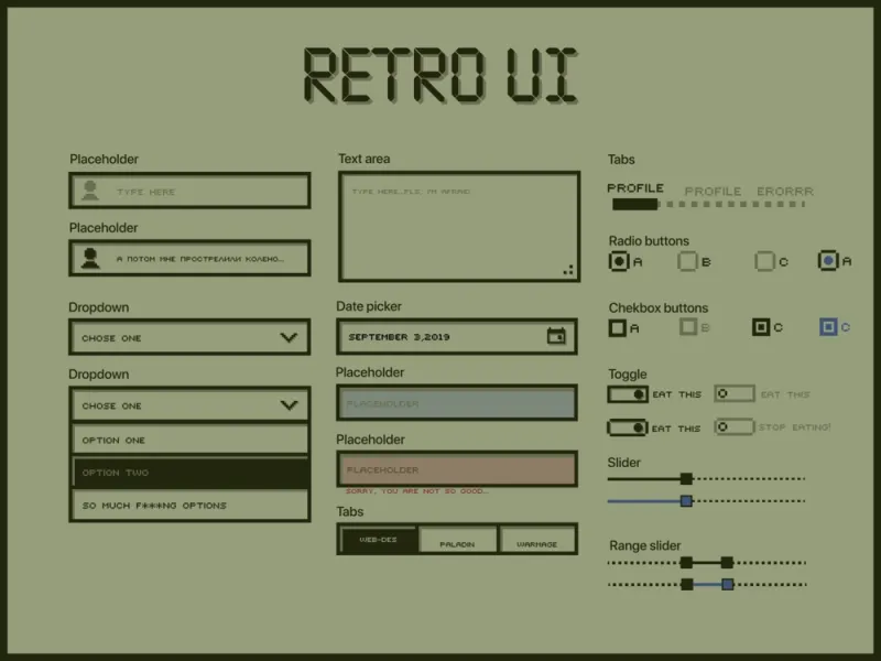
Photo: minimalist retro computer screen text interface, via i.pinimg.com
The Site That Made You Wait
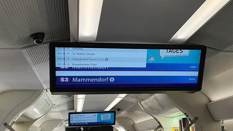
You clicked the link and nothing happened for a second. Then text appeared, line by line, like someone was typing it in real time. No hero image. No animation. No gradient. Just words loading into a white background at a pace that felt almost biological. By the time the page finished rendering, you weren't annoyed—you were somehow more interested than you would have been if it had loaded instantly.
This is the experience that a growing cluster of web designers, artists, and independent creators are deliberately engineering. Call it bandwidth aesthetics, lo-fi web design, or just the anti-everything school of internet architecture. Whatever the label, the movement is real, it's spreading, and it's making some of the most genuinely interesting corners of the web look like they're held together with dial-up and determination.
The Reaction to Everything Being Too Much
To understand why this is happening, you have to look at what it's reacting against. The mainstream web in 2024 is a maximalist environment. Autoplay video. Infinite scroll. Cookie banners stacked on top of newsletter popups stacked on top of chat widgets. Every major platform has optimized relentlessly for engagement metrics that reward stimulation, speed, and novelty.
The result is a browsing experience that's technically impressive and psychologically exhausting. Pages load in milliseconds and immediately demand your attention from seventeen directions at once. The user isn't really a visitor anymore—they're a target.
Against that backdrop, a site that loads slowly and quietly and gives you one thing to look at doesn't feel broken. It feels like relief.
Designers working in this space talk about it in terms of intentionality. Every element that gets removed is a decision. Every constraint is a statement. The stripped-down site isn't failing to be a normal website—it's refusing to be one.
What These Sites Actually Look Like
The aesthetic varies, but certain signatures show up consistently. Monochrome or near-monochrome palettes. Text rendered in system fonts—the kind that browsers default to when no custom font loads, which in the old days meant your page was broken, and now means you're making a point. Navigation that's purely functional, sometimes just a list of links with no visual hierarchy whatsoever.
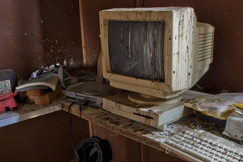
Some designers lean into the temporal dimension: sites that load content in stages, that reveal text word by word, that make the act of reading feel like it's happening in real time rather than all at once. Others embrace raw HTML aesthetics—the kind of page structure that looks like someone built it in Notepad in 1997 and just never updated it. Horizontal rules. Underlined blue links. Tables used for layout.
The more conceptually adventurous versions play with simulated loading failure. Pages that appear to stall, then continue. Images that render corrupted before resolving. Text that flickers before settling. These aren't malfunctions—they're choreographed. The experience of a struggling page becomes the content itself.
Status Symbol in Unexpected Places
Here's what makes this more than just a design preference: in certain online communities, having a site that looks like this has become a marker of credibility. Independent musicians, writers, artists, and developers who operate in underground or experimental spaces have adopted the lo-fi web aesthetic as a signal—a way of communicating values without stating them directly.
A site that's this stripped down says: I'm not trying to sell you something. I'm not optimized for your attention. I built this myself, and I built it this way on purpose. In communities where authenticity is currency, that message lands hard.
There's also a practical dimension that feeds back into the aesthetic. Many of these sites are genuinely cheap to run—sometimes free. They don't require JavaScript frameworks or CDN infrastructure or monthly subscriptions to design tools. They're just files. That accessibility has a democratizing effect: anyone with basic HTML knowledge can build something that looks intentional and interesting, without needing a budget or a team.
The Weird Politics of Slow
Some designers working in this space are pretty explicit about the political dimension. The fast, smooth, data-hungry web is built on an extractive model—your attention and your behavioral data are the product. A site that refuses to track you, that doesn't load third-party scripts, that doesn't A/B test its button colors, is opting out of that economy in a small but legible way.
This isn't a new argument—the indie web and small web movements have been making versions of it for years. But the aesthetic angle gives it new traction. When the look of a site communicates these values, the message becomes accessible even to people who don't care about the technical or political specifics. The vibe is the argument.
Whether that's meaningful resistance or just resistance cosplay is a fair question. A hand-coded HTML page on a niche hosting service isn't going to disrupt Big Tech. But it might create a different kind of space—one where the experience of browsing feels less like being processed and more like visiting somewhere that was built for you to actually be in.
The Signal Worth Catching
What's genuinely interesting about this movement is how it inverts the usual relationship between limitation and quality. On the mainstream web, constraints are problems to be engineered away. More bandwidth, faster servers, better compression—the goal is always to make the gap between intent and delivery disappear.
Bandwidth aesthetics says: what if the gap is the interesting part? What if the load time, the stutter, the visible structure of the page—what if those aren't bugs to be fixed but textures to be worked with?
It's the same question that lo-fi music asked about recording quality, and that found-footage film asked about camera stability. When you stop treating the medium's limitations as problems, they become a vocabulary. And some people, it turns out, have a lot to say with it.